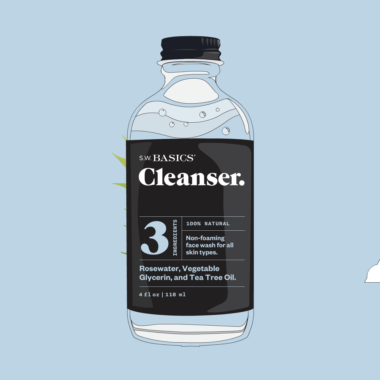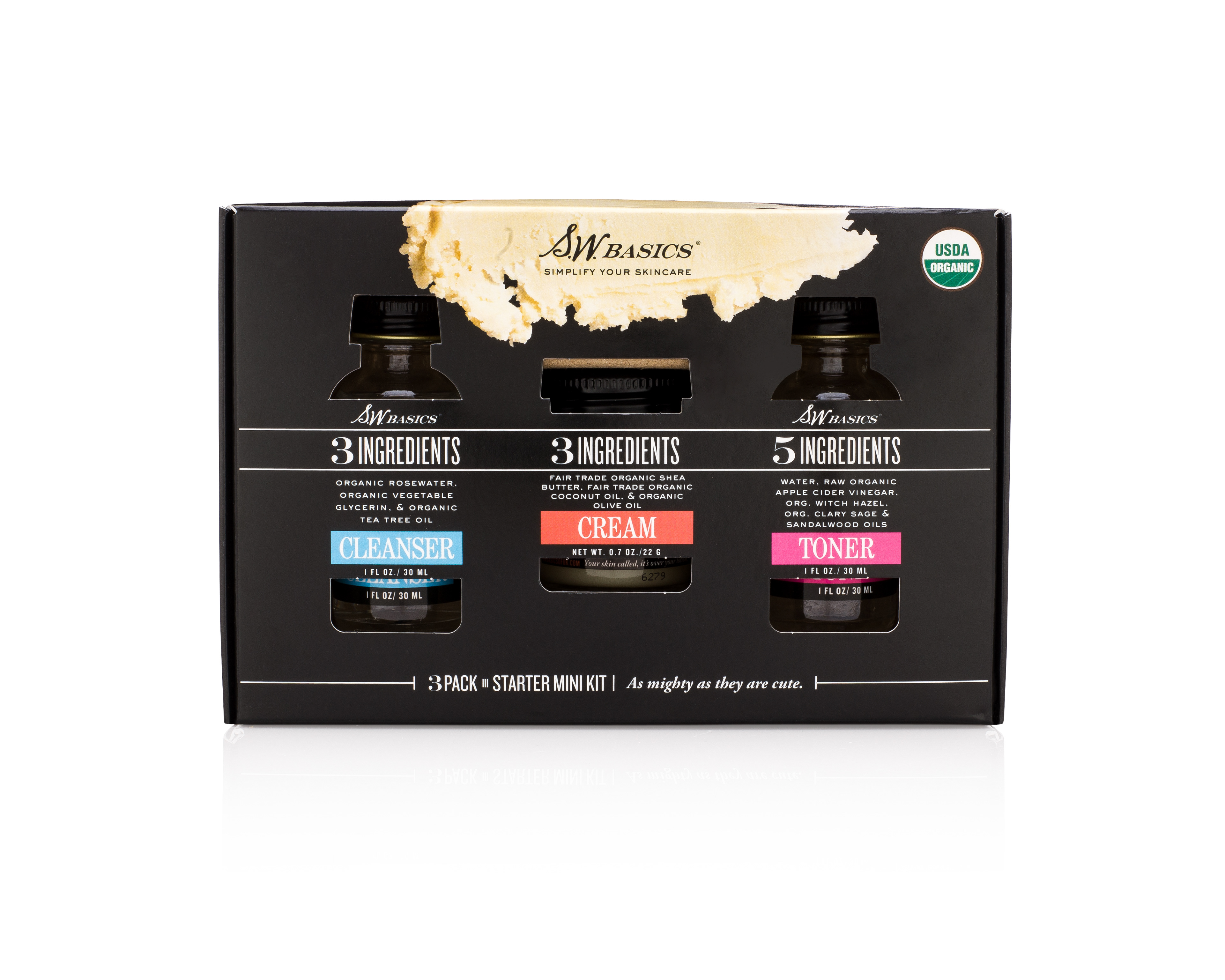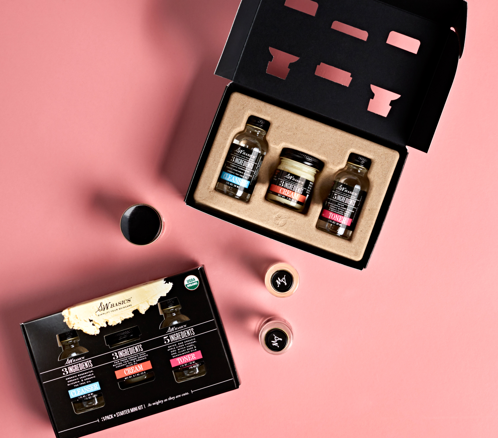
THE FOCUS
The desire was to streamlined label design, establishing a clear hierarchy for consumers that prioritizes the logo, highlights five key ingredients, and emphasizes the product as a toner.
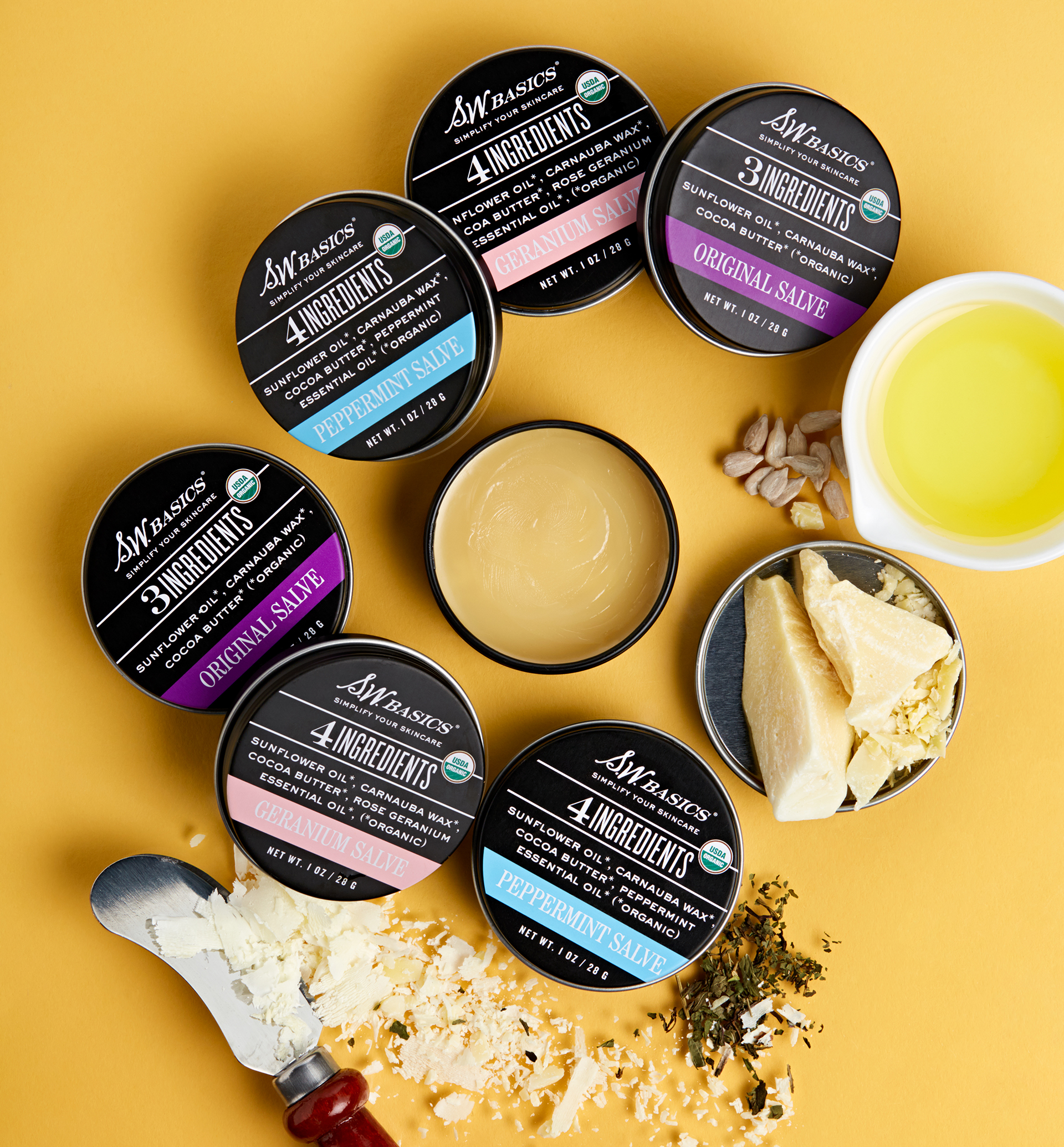
Maintaining continuity with our established color spectrum of predominantly black with a vibrant accent, the label transition was orchestrated for seamless integration.
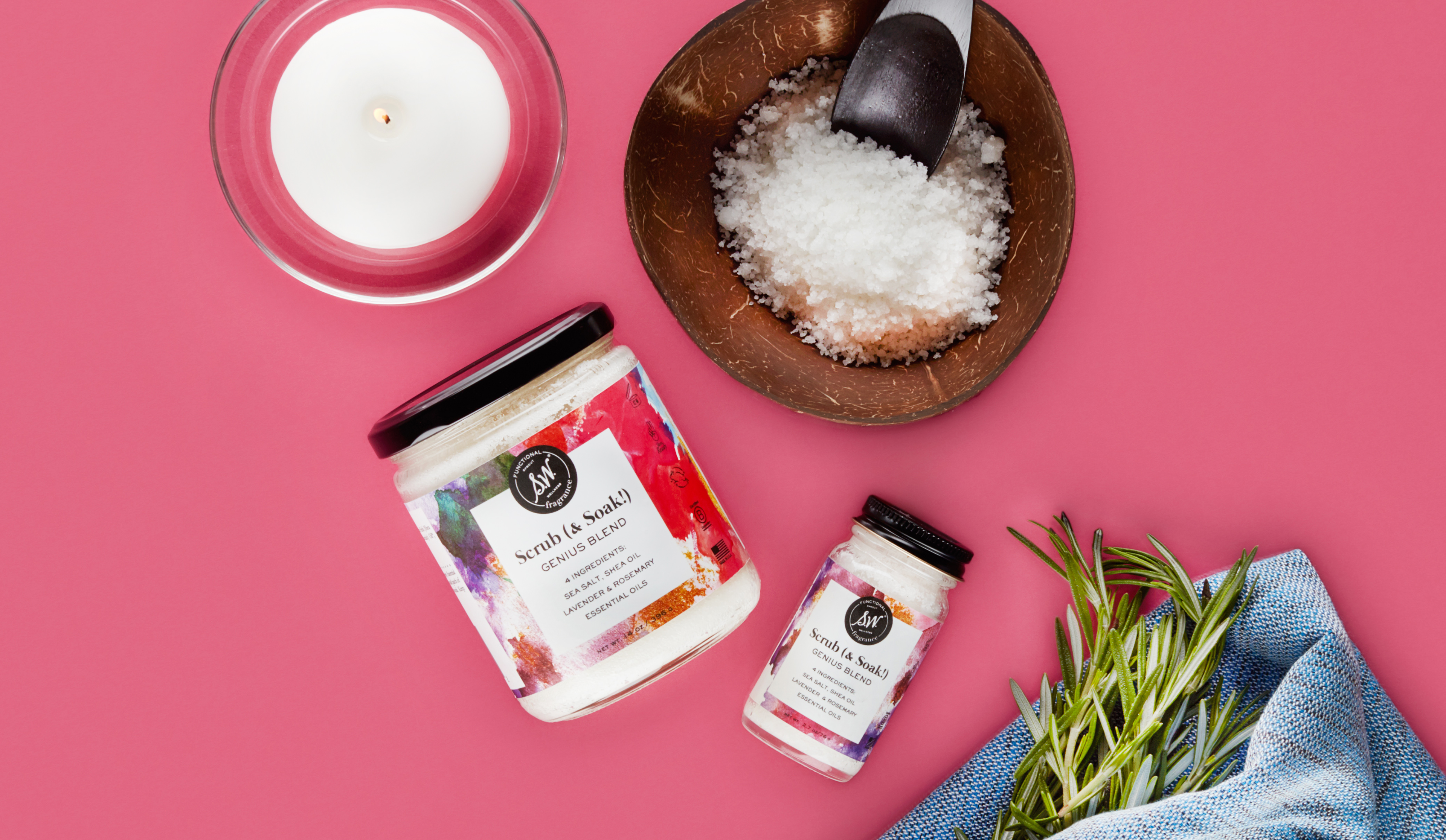
PRIMARY OBJECTIVE
Led the end-to-end development, from conceptualization to the production of the Functional Fragrance line of blended bath scrubs. Employed bespoke watercolor designs featuring saturated colors, meticulously crafted to evoke the nuanced depth and potency of the various scent layers. Overall at the Art Director, my role encompassed packaging, photography direction, ecom, illustration and branding.