THE FOCUS
Achieving clean packaging that harmonized with our iconic pink branding.
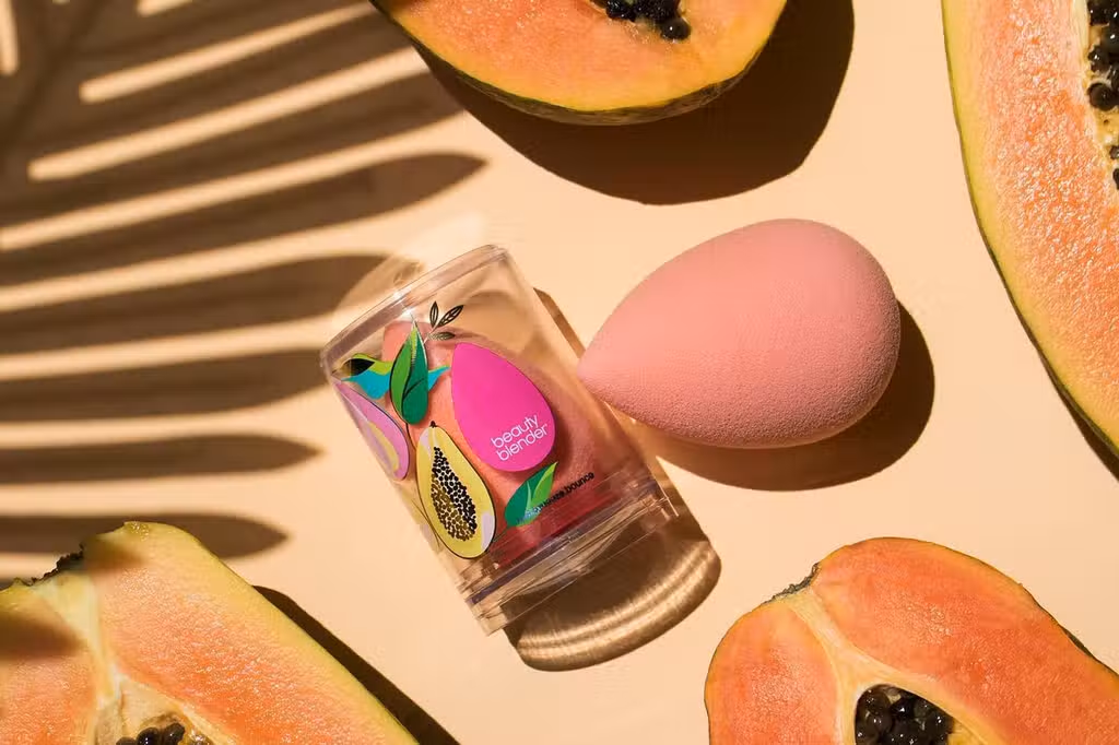
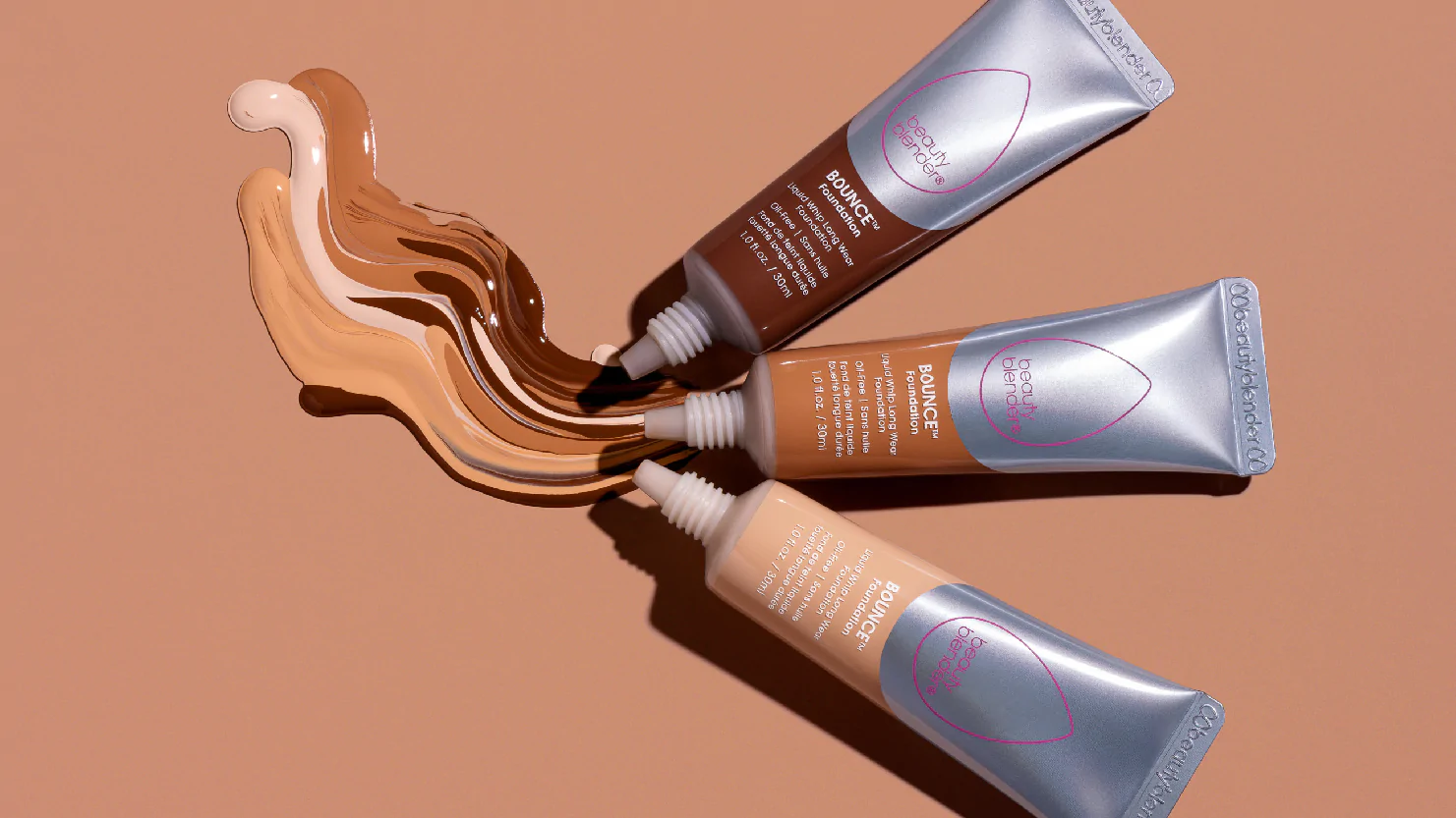
When I joined Beautyblender, the complexion range was just beginning to take shape. However, with new products launching, it became clear that we needed to revisit how the logo was used across the complexion line and establish a cohesive branding structure.
PRIMARY OBJECTIVE
To enhance the logo's visual identity so it would stand out on kits and cleansers without clashing with additional artwork.
Additionally, I developed an icon-based system to clearly communicate key ingredients and expected results to our customers. Another key task was updating our signature pink to a Pantone color that would be consistent across all vendors, techniques, and finishes in both packaging and digital formats.
I approached this project with a detective's mindset, engaging with senior team members, gathering customer insights, and analyzing brand perception. The process was extensive, but ultimately, I delivered several presentations to senior management, outlining challenges and solutions, leading to the successful rollout of our updated design.
As we expanded the line, I collaborated closely with the product development team to identify packaging solutions that seamlessly aligned with our brand identity across various products.
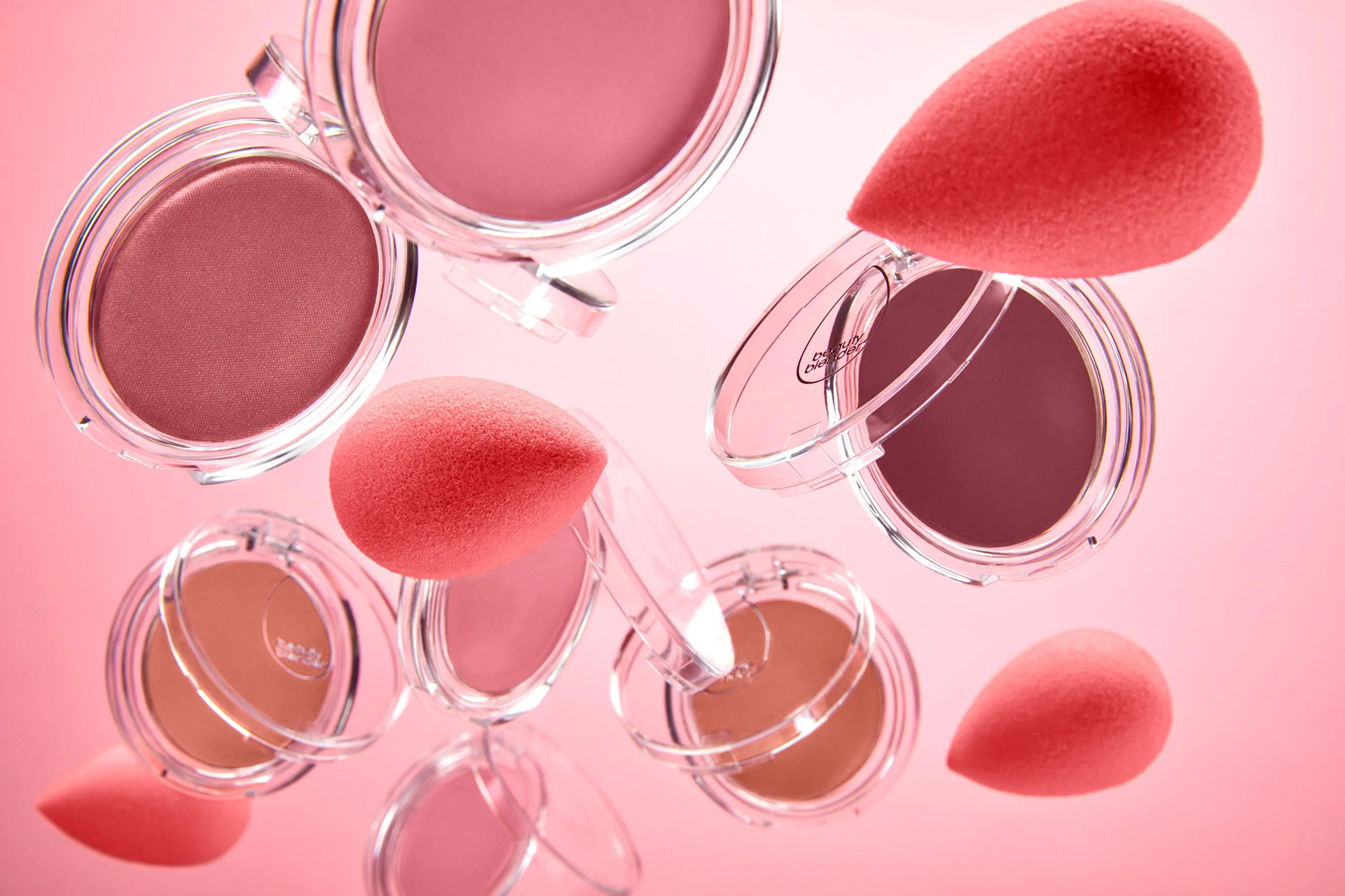
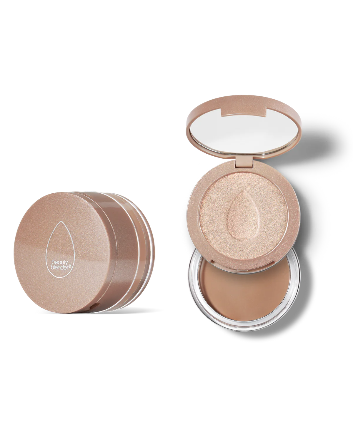
Blush Packaging
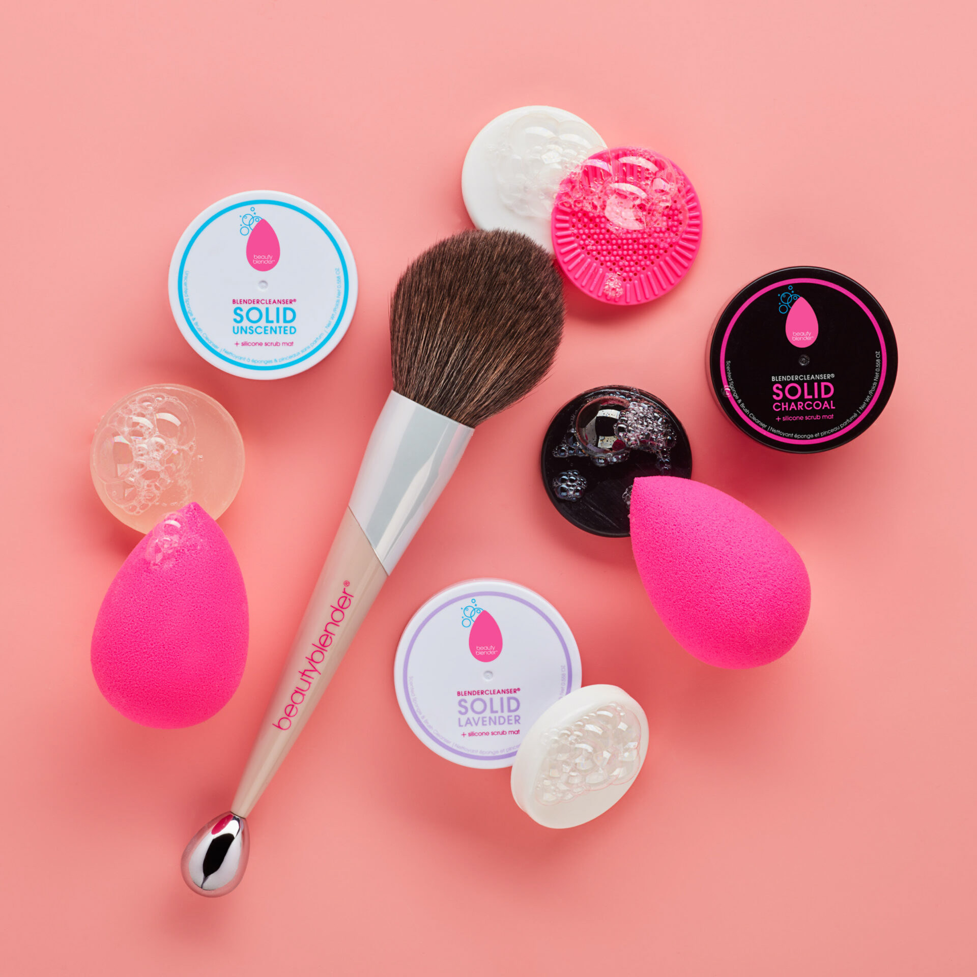
Solid Cleanser packaging
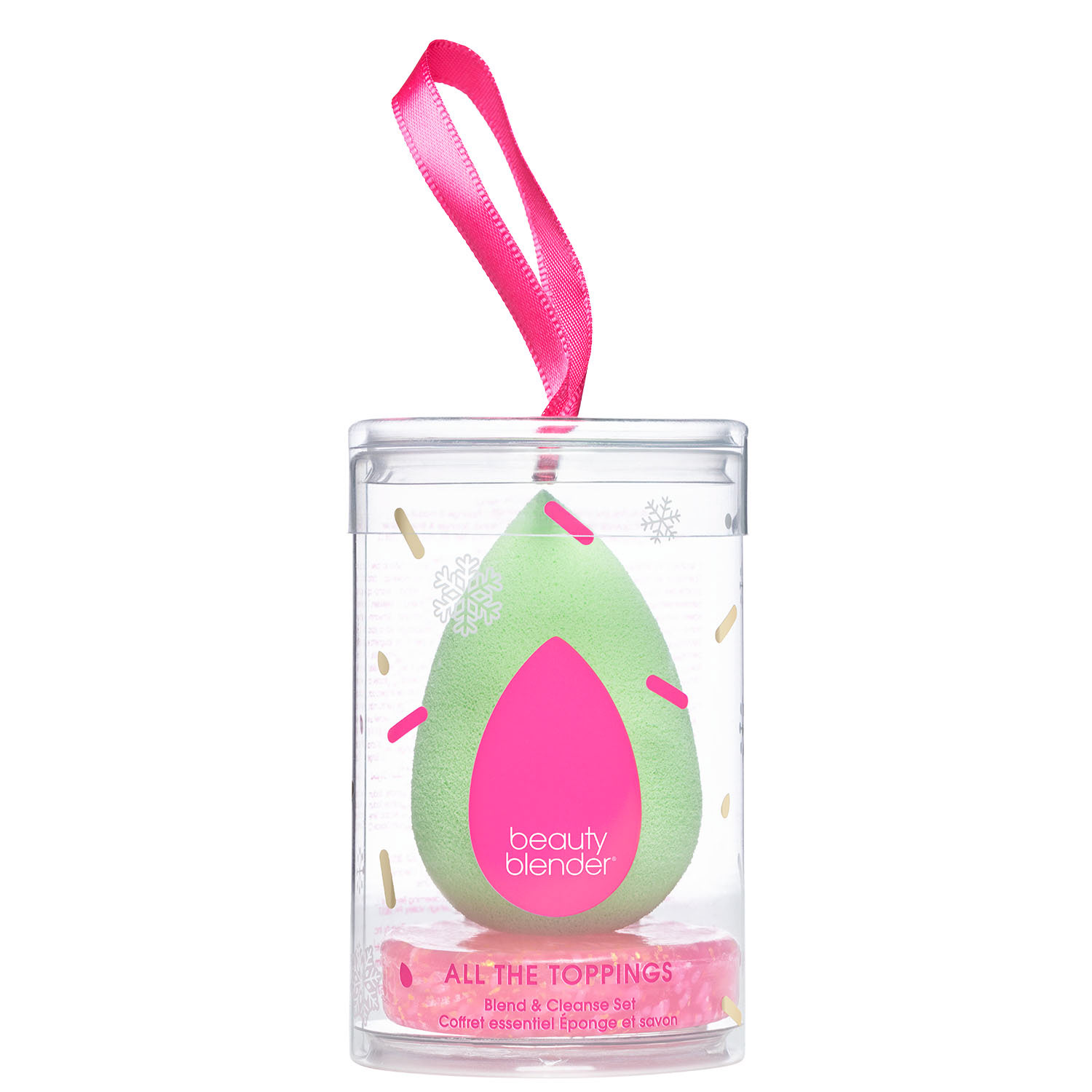
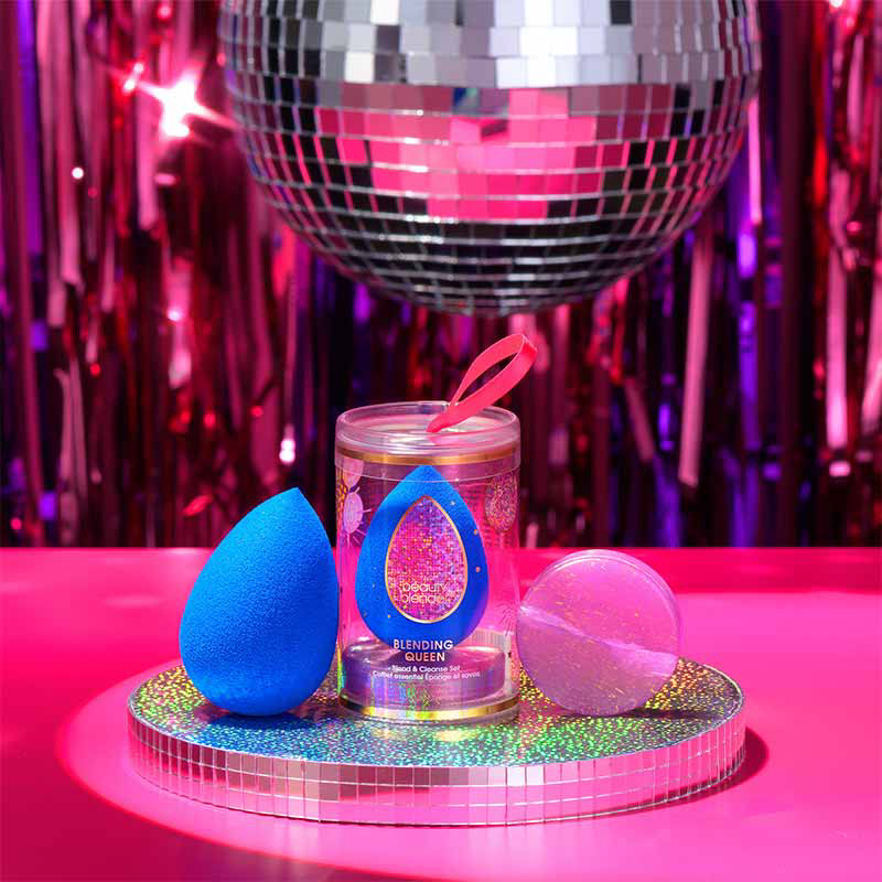
Holiday packaging
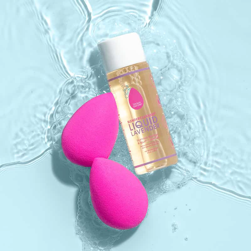
Cleanser

Kits!
